# Libraries
library(dplyr)
library(ggplot2)

# Loading mtcars
data(mtcars)LOESS Regression
Introduction
In this chapter, we examine the method of LOESS (Locally Estimated Scatterplot Smoothing), a non-parametric approach for fitting a smooth curve through a scatterplot. In contrast to traditional linear regression, which estimates a single global linear relationship across all observations, LOESS performs localized linear regressions around each data point. This enables the model to capture more complex, non-linear patterns in the data. A basic understanding of linear regression is nonetheless beneficial, as LOESS builds upon its principles by incorporating local fitting techniques.
Preliminary Setup
We begin by loading the necessary packages, dplyr and ggplot2, along with the built-in mtcars dataset, which is available upon installing R:
The mtcars dataset consists of 32 observations and 11 variables, providing information on various automobile attributes, including fuel consumption. For illustrative purposes, we will focus on two variables: wt (weight of the car) and mpg (miles per gallon). To facilitate the analysis, we create a new dataset containing only those variables, and rename it data, for clarity:
# Selecting variables and creating a new object
data <- mtcars %>%
  select(Weight = wt,
         Miles_per_Gallon = mpg)
The scatterplot below illustrates the relationship between vehicle weight and fuel efficiency:
# Setting theme
theme_set(theme_light() +
  theme(plot.title = element_text(hjust = 0.5)))

# Scatterplot with one linear regression line
data %>%
  ggplot(aes(x = Weight,
             y = Miles_per_Gallon)) +
  geom_point(color = "blue") +
  expand_limits(x = 0, y = 0) +
  labs(x = "Weight",
       y = "Miles per Gallon")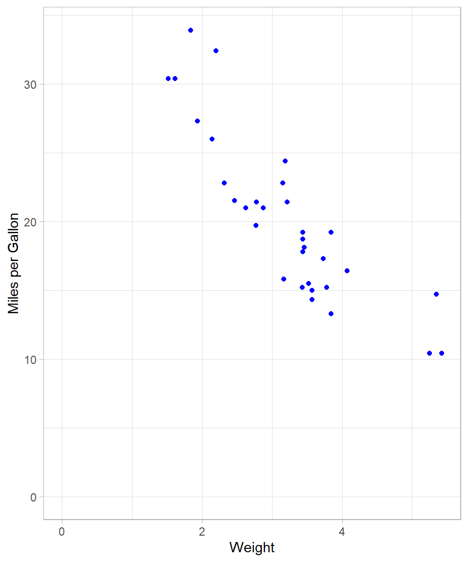
A negative linear trend is apparent: as vehicle weight increases, miles per gallon tend to decrease.
Linear Regression via OLS
The conventional method for estimating linear relationships is Ordinary Least Squares (OLS) (see Chapter Simple Linear Regression). As a reminder, the objective of OLS is to minimize the sum of squared residuals, thereby identifying the best-fitting linear model. OLS therefore fits a single straight line that approximates all data points. We can visualize this fit using geom_smooth() with the method = "lm" argument. Setting se = FALSE suppresses the confidence interval.
# Scatterplot with simple linear regression
data %>%
  ggplot(aes(x = Weight,
             y = Miles_per_Gallon)) +
  geom_point(color = "blue") +
  geom_smooth(method = "lm",
              se = FALSE,
              color = "black") +
  expand_limits(x = 0, y = 0) +
  labs(x = "Weight",
       y = "Miles per Gallon")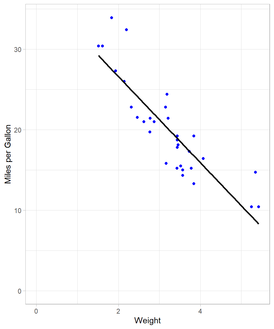
To fit the model explicitly, we use the lm() function:
# Creating a linear regression model
lm_model <- lm(Miles_per_Gallon ~ Weight, data = data)
Although the visual fit appears reasonable, we can assess model fit using summary statistics. The R-squared value, for instance, quantifies the proportion of variance in Miles_per_Gallon explained by Weight:
# Checking summary results
lm_model %>% summary()
Call:
lm(formula = Miles_per_Gallon ~ Weight, data = data)

Residuals:
    Min      1Q  Median      3Q     Max
-4.5432 -2.3647 -0.1252  1.4096  6.8727

Coefficients:
            Estimate Std. Error t value Pr(>|t|)
(Intercept)  37.2851     1.8776  19.858  < 2e-16 ***
Weight       -5.3445     0.5591  -9.559 1.29e-10 ***
---
Signif. codes:  0 '***' 0.001 '**' 0.01 '*' 0.05 '.' 0.1 ' ' 1

Residual standard error: 3.046 on 30 degrees of freedom
Multiple R-squared:  0.7528,    Adjusted R-squared:  0.7446
F-statistic: 91.38 on 1 and 30 DF,  p-value: 1.294e-10
The resulting R-squared of approximately 0.75 indicates that 75% of the variation in fuel efficiency is explained by vehicle weight.
We can of course use OLS to capture a non-linear relationship by using polynomial terms, meaning that we can include the same (independent variable) on the power of 2 or higher.
The following plot shows the regression line when we add 2nd degree polynomial term. The code is almost the same as previously; we just adjusted the argument formula:
# Scatterplot with linear regression line with polynomial terms
data %>%
  ggplot(aes(x = Weight,
             y = Miles_per_Gallon)) +
  geom_point(color = "blue") +
  geom_smooth(method = "lm",
              formula = y ~ poly(x, 2),
              se = FALSE,
              color = "black") +
  expand_limits(x = 0, y = 0) +
  labs(x = "Weight",
       y = "Miles per Gallon")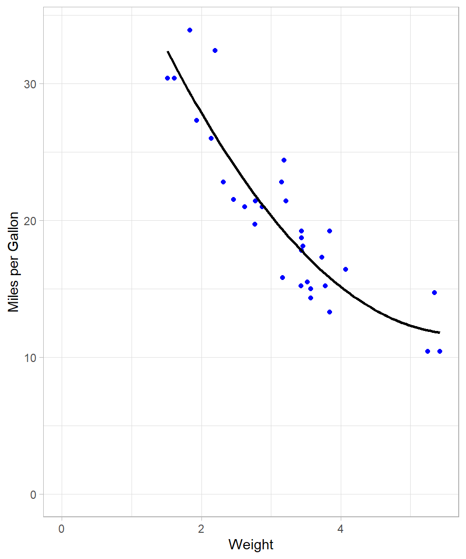
This line seems much more flexible and it fits the data data. We can actually confirm this by checking the R-squared of the new polynomial model:
# Creating a linear regression model and checking summary results
lm(Miles_per_Gallon ~ poly(Weight, 2), data = data) %>% summary()
Call:
lm(formula = Miles_per_Gallon ~ poly(Weight, 2), data = data)

Residuals:
   Min     1Q Median     3Q    Max
-3.483 -1.998 -0.773  1.462  6.238

Coefficients:
                 Estimate Std. Error t value Pr(>|t|)
(Intercept)       20.0906     0.4686  42.877  < 2e-16 ***
poly(Weight, 2)1 -29.1157     2.6506 -10.985 7.52e-12 ***
poly(Weight, 2)2   8.6358     2.6506   3.258  0.00286 **
---
Signif. codes:  0 '***' 0.001 '**' 0.01 '*' 0.05 '.' 0.1 ' ' 1

Residual standard error: 2.651 on 29 degrees of freedom
Multiple R-squared:  0.8191,    Adjusted R-squared:  0.8066
F-statistic: 65.64 on 2 and 29 DF,  p-value: 1.715e-11
R-squared increased to approximately 82%, implying a better fit. Theoretically, the more polynomial terms we add, the more flexible our global line will be. For instance, with a 10 degree polynomial, the plot looks like this:
# Scatterplot
data %>%
  ggplot(aes(x = Weight, y = Miles_per_Gallon)) +
  geom_point(color = "blue") +
  geom_smooth(method = "lm",
              formula = y ~ poly(x, 10),
              se = FALSE,
              color = "black") +
  expand_limits(x = 0, y = 0) +
  labs(x = "Weight",
       y = "Miles per Gallon")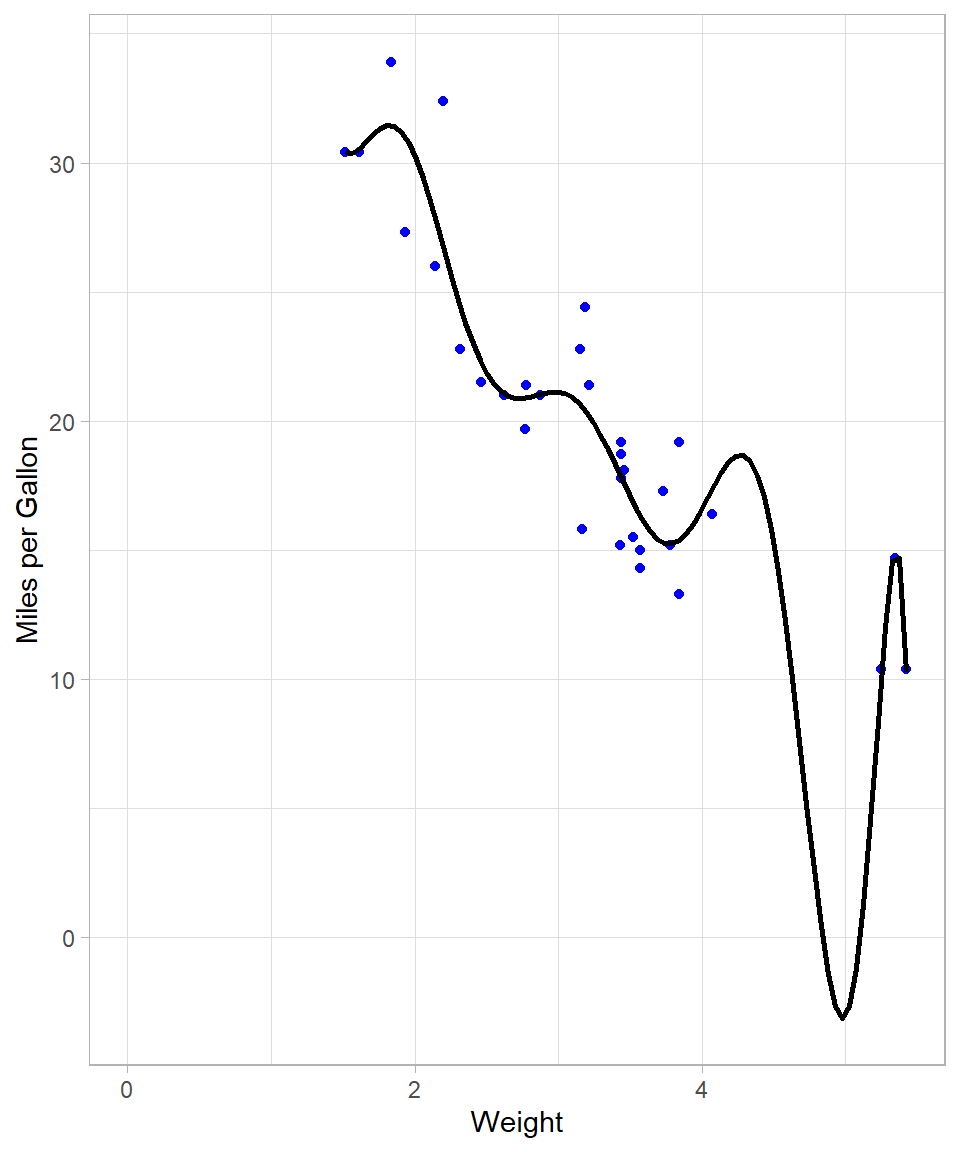
# Creating a linear regression model and checking summary results
lm(Miles_per_Gallon ~ poly(Weight, 10), data = data) %>% summary()
Call:
lm(formula = Miles_per_Gallon ~ poly(Weight, 10), data = data)

Residuals:
    Min      1Q  Median      3Q     Max
-4.7398 -1.3360 -0.0580  0.9806  5.6807

Coefficients:
                   Estimate Std. Error t value Pr(>|t|)
(Intercept)         20.0906     0.4664  43.080  < 2e-16 ***
poly(Weight, 10)1  -29.1157     2.6381 -11.037 3.35e-10 ***
poly(Weight, 10)2    8.6358     2.6381   3.274  0.00363 **
poly(Weight, 10)3    0.2749     2.6381   0.104  0.91800
poly(Weight, 10)4   -1.7891     2.6381  -0.678  0.50507
poly(Weight, 10)5    1.8797     2.6381   0.713  0.48398
poly(Weight, 10)6   -2.8354     2.6381  -1.075  0.29467
poly(Weight, 10)7    2.5613     2.6381   0.971  0.34266
poly(Weight, 10)8    1.5772     2.6381   0.598  0.55634
poly(Weight, 10)9   -5.2412     2.6381  -1.987  0.06015 .
poly(Weight, 10)10  -2.4959     2.6381  -0.946  0.35486
---
Signif. codes:  0 '***' 0.001 '**' 0.01 '*' 0.05 '.' 0.1 ' ' 1

Residual standard error: 2.638 on 21 degrees of freedom
Multiple R-squared:  0.8702,    Adjusted R-squared:  0.8084
F-statistic: 14.08 on 10 and 21 DF,  p-value: 3.462e-07
We see though that the resulting line needs to bend a lot when the weight is close to 5. This is necessary because the model tries to capture the points that are relatively further away from the rest. We also see that R-squared increased to approximately 87% (although the adjusted R-square stayed almost the same).
Nonetheless, the last model does not make; we would never expect the miles per gallon being below zero! This already shows that when we try to make the line very flexible with OLS, the output may simply become unreliable.
Transitioning from Global to Local: Introduction to LOESS
OLS employs a single, global model for all data points. While the inclusion of polynomial terms can increase flexibility, we saw that this approach has its limitations and can give us a distorted picture.
LOESS (Locally Estimated Scatterplot Smoothing) offers an alternative approach by estimating localized regressions around each observation. Instead of fitting a single line, LOESS constructs multiple local linear models that collectively form a smooth, non-linear curve through the data. The method was originally introduced by Cleveland (1979) and later formalized by Cleveland and Devlin (1988), and it is now widely discussed in modern statistical learning literature ((Hastie, Tibshirani, and Friedman, 2009).
The visualization below overlays both the OLS line (black) and the respective LOESS curve (red):
# Scatterplot with two regression lines
data %>%
  ggplot(aes(x = Weight,
             y = Miles_per_Gallon)) +
  geom_point(color = "blue") +
  geom_smooth(method = "lm",
              se = FALSE,
              color = "black") +
  geom_smooth(method = "loess",
              se = FALSE,
              color = "red") +
  expand_limits(x = 0, y = 0) +
  labs(x = "Weight",
       y = "Miles per Gallon")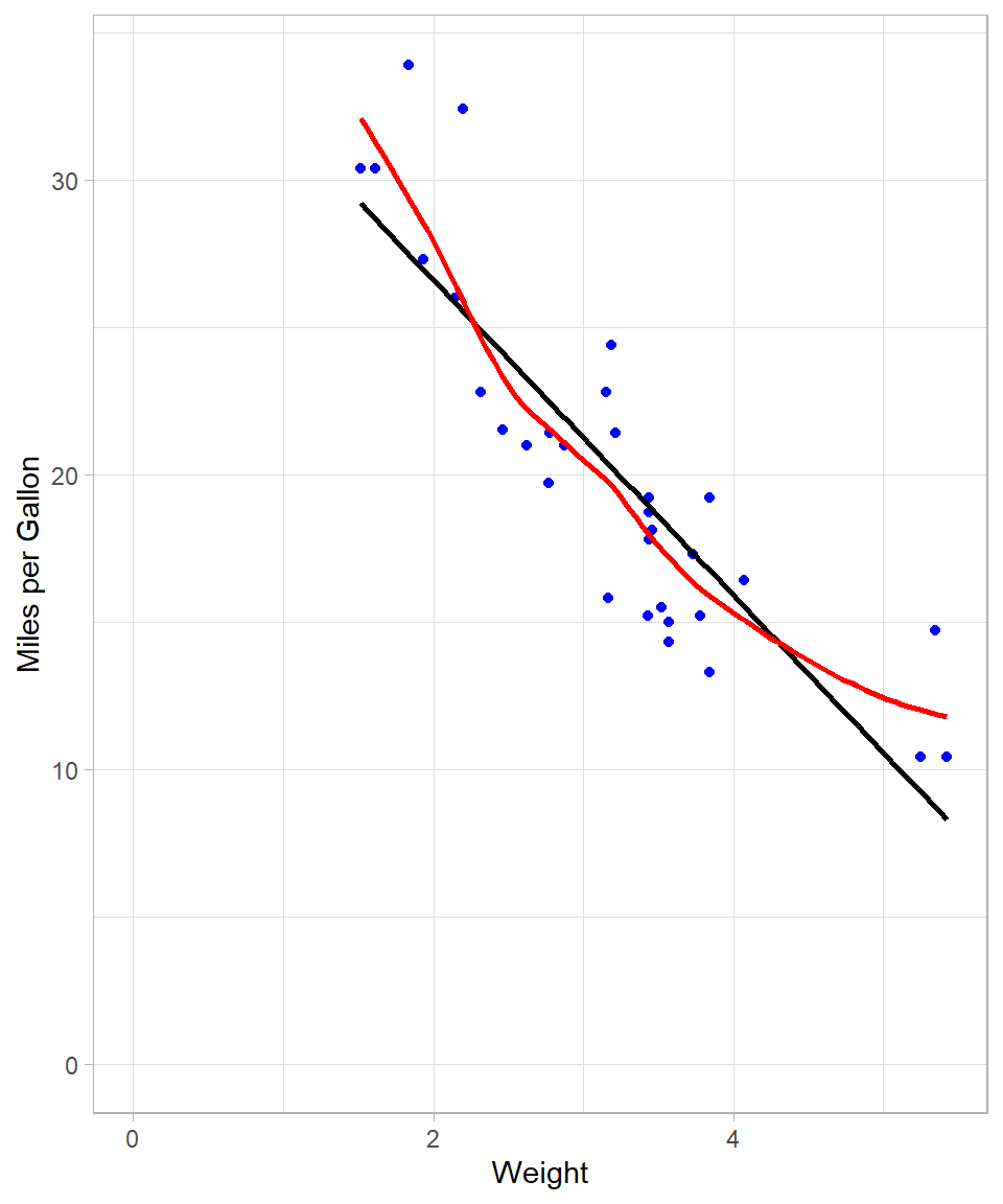
The LOESS curve is more adaptable and captures subtle patterns that the global OLS line cannot. This is achieved by fitting local regressions across the data space. Even though at this example the line looks a lot like the one that we got with the 2nd degree polynomial, there are some local spots where the flexibility of LOESS is obvious (see plot below):
# Scatterplot with two regression lines
data %>%
  ggplot(aes(x = Weight, y = Miles_per_Gallon)) +
  geom_point(color = "blue") +
  geom_smooth(method = "lm",
              formula = y ~ poly(x, 2),
              se = FALSE,
              color = "black") +
  geom_smooth(method = "loess",
              se = FALSE,
              color = "red") +
  expand_limits(x = 0, y = 0) +
  labs(x = "Weight",
       y = "Miles per Gallon")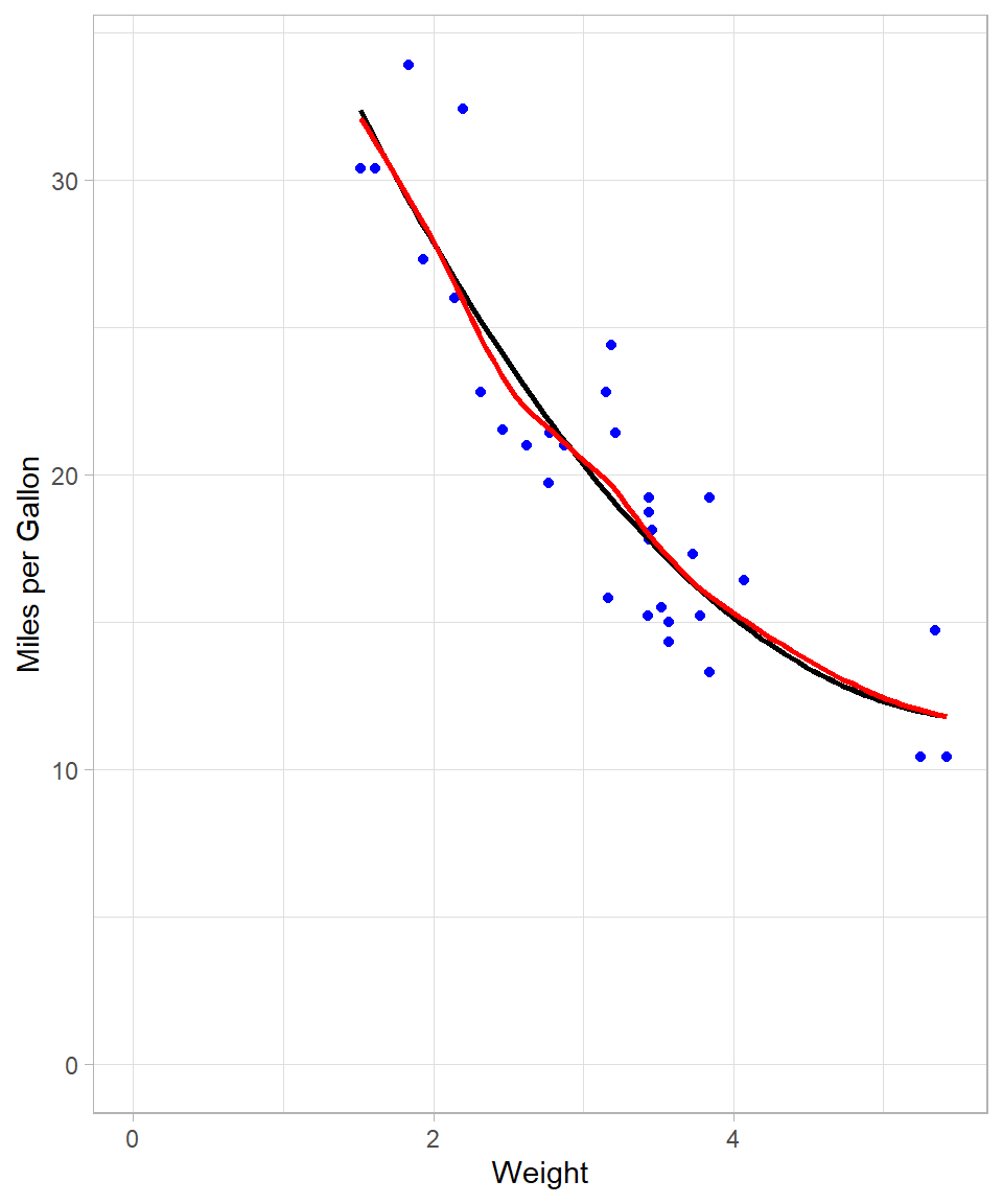
Mechanics of LOESS
LOESS employs a moving window approach: for each focal data point, a subset of neighboring observations—termed “neighbors”—is selected. The proportion of neighbors used is governed by the bandwidth parameter, specified as a fraction of the total dataset. For instance, with 30 observations and a bandwidth of 0.2, the six nearest neighbors (20% of the data) are used to fit a local regression.
Unlike OLS, which assigns equal weight to all points, LOESS assigns greater weight to closer neighbors. This is implemented via Weighted Least Squares (WLS), where weights decline with increasing distance from the focal point. Consequently, LOESS is sometimes referred to as LOWESS (Locally Weighted Scatterplot Smoothing).
After fitting local models, LOESS makes predictions at each data point and connects them to create a smooth curve. In our example, we used just one predictor variable—meaning we looked at how the outcome (miles per gallon) changes as one thing (vehicle weight) changes. This is called “using a single predictor”. But LOESS, just like OLS, isn’t limited to one input. It can also be used with multiple predictors at the same time. For example, we could look at how both vehicle weight and engine size together affect miles per gallon. LOESS can also handle more complex situations, like when the effect of one variable depends on another, or when the relationship is curved rather than a straight line.
Implementing LOESS in R
In R, the loess() function (available in the stats package) fits a LOESS model. Its syntax resembles that of lm(), with the addition of the span argument, which specifies the bandwidth.
We fit two LOESS models using spans of 0.2 and 0.8, and then evaluate their predictive performance by calculating the pseudo R-squared, which is derived from the residual sum of squares (RSS) and total sum of squares (TSS). While technically, comparing the R-squared from OLS and the pseudo R-squared from LOESS is not appropriate due to the different nature of these models—OLS being a global linear model and LOESS a local non-linear model—we do so here for simplicity and intuition. This approach provides an intuitive measure of fit, even though the models have different underlying assumptions and structures.
# LOESS with 20% bandwidth
## Fitting the model
loess_0.2 <- loess(Miles_per_Gallon ~ Weight,
                   data = data,
                   span = 0.2)

## Making predictions
loess_0.2_preds <- predict(loess_0.2, data)

## Calculating R-squared
### Calculating residual sum of squares (RSS)
rss <- sum((data$Miles_per_Gallon - loess_0.2_preds)^2)
# Calculating total sum of squares (TSS)
tss <- sum((data$Miles_per_Gallon - mean(data$Miles_per_Gallon))^2)
# Calculating pseudo R-squared
r_squared <- 1 - (rss / tss)
# Printing pseudo R-squared
r_squared
[1] 0.8954292# LOESS with 80% bandwidth
## Fitting the model
loess_0.8 <- loess(Miles_per_Gallon ~ Weight,
data = data,
span = 0.8)
## Making predictions
loess_0.8_preds <- predict(loess_0.8, data)
## Calculating R-squared
### Calculating residual sum of squares (RSS)
rss <- sum((data$Miles_per_Gallon - loess_0.8_preds)^2)
### Calculating total sum of squares (TSS)
tss <- sum((data$Miles_per_Gallon - mean(data$Miles_per_Gallon))^2)
### Calculating pseudo R-squared
r_squared <- 1 - (rss / tss)
### Printing pseudo R-squared
r_squared[1] 0.8256546Models with a smaller bandwidth (0.2 in this case) generally offer a closer fit to the data, albeit at the risk of overfitting. Conversely, a larger bandwidth (0.8) produces a smoother, less complex curve. To compare visually:
# Creating scatterplot with LOESS and OLS regression lines
data %>%
  ggplot(aes(x = Weight, y = Miles_per_Gallon)) +
  geom_point(color = "blue") +
  geom_smooth(method = "lm",
              se = FALSE,
              color = "black") +
  geom_smooth(method = "loess",
              span = 0.2,
              se = FALSE,
              color = "red") +
  geom_smooth(method = "loess",
              span = 0.8,
              se = FALSE,
              color = "green") +
  expand_limits(x = 0, y = 0) +
  labs(x = "Weight",
       y = "Miles per Gallon")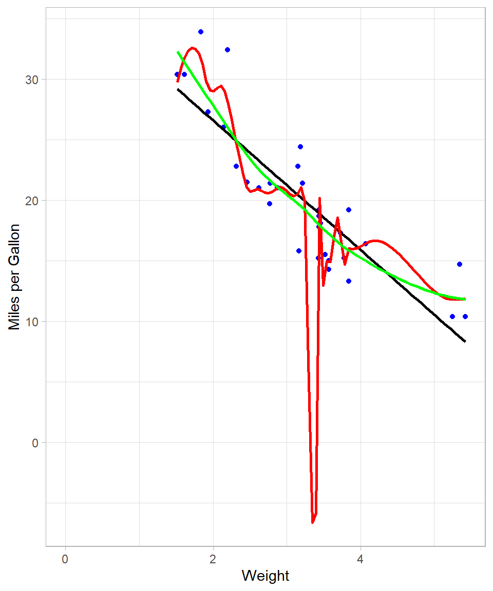
The red curve (span = 0.2) is highly flexible and follows the data closely, while the green curve (span = 0.8) is more stable and arguably better suited for generalization.
In general, it becomes obvious that, the less the bandwidth, the more complex the model will be, which is what provides for better fit against the data. This is not always the best approach though as—at the extreme—the model would fit a line that passes through all the available data points. Such model would make no sense in terms of interpretability. This is the same phenomenon with trying to use high-degree polynomial to fit a linear regression line using OLS. In our example above, we see that red line implies negative miles per gallon values, something that is impossible! Overfitting is something we still need to take into consideration when using LOESS.
Purpose of LOESS
LOESS is designed to reveal patterns in data that are difficult to capture with traditional linear regression. As mentioned, OLS fits a single global line to the entire dataset while LOESS adapts locally, fitting small weighted regressions around each observation. This local approach allows LOESS to uncover non-linear relationships and produce smooth trends that better reflect the structure of the data.
The method is particularly useful for descriptive modeling and exploratory analysis. It excels when the goal is to visualize trends, detect patterns, or make local predictions rather than to generate a single global formula. By assigning greater weight to nearby points, LOESS balances flexibility and stability, revealing subtle structures without being overly influenced by distant observations.
In practice, LOESS helps answer questions such as how the response variable changes across the range of predictors, whether there are local trends or deviations that a global model might miss, and what patterns can be visualized before applying more formal modeling techniques. Therefore, LOESS is a valuable tool for understanding and visualizing complex relationships in data, providing insights that guide further analysis and decision-making.
From a machine learning standpoint, LOESS has one hyperparameter: the bandwidth (or span), which determines the proportion of neighbors considered in each local regression. Smaller bandwidths yield more complex models, which may fit the data more closely but are also more prone to overfitting. The optimal choice depends on the specific context and objectives of the analysis.
Recap
This chapter has presented an intuitive overview of LOESS, a method that extends linear regression by applying Weighted Least Squares locally around each data point. LOESS is particularly effective for uncovering non-linear relationships and creating smooth data visualizations.
We discussed the mechanics of LOESS, including the moving window approach and the use of Weighted Least Squares to assign greater importance to nearby points. We also highlighted the key hyperparameter, the bandwidth (or span), which controls the trade-off between flexibility and smoothness. Smaller bandwidths result in more flexible curves that may overfit, while larger bandwidths produce smoother trends.
Practical implementation in R was demonstrated using the loess() function and geom_smooth() in ggplot2, showing how different bandwidths affect the fitted curve. Finally, we emphasized the purpose of LOESS: it is a powerful tool for descriptive modeling, exploratory analysis, and visualizing complex relationships, though it is not ideal when a single analytical formula is required.